Cris    •    Tábuas & Tal

Brand

  • Cristina Restier
  • Cris Tábuas & Tal
  • Brand
  • 2021
01
Problem

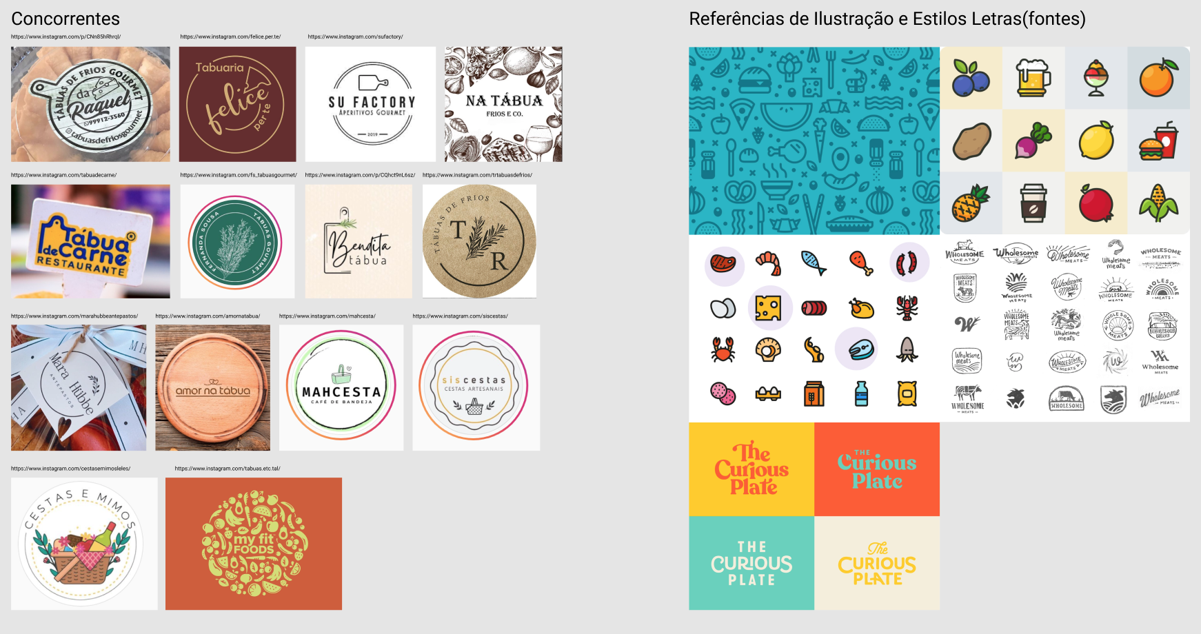
This client wanted a logo for their breakfast boxes business. She wanted the logo to bring preparation elements such as seasonings, cheeses, etc.

Also desired the logo to have a fancy look as a special treatment to the clients.

02
Process

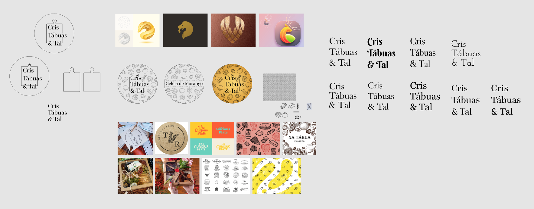
She had some ideas about the name but not a final idea and neither a full idea of the elements, so we started with:
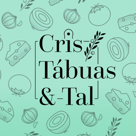
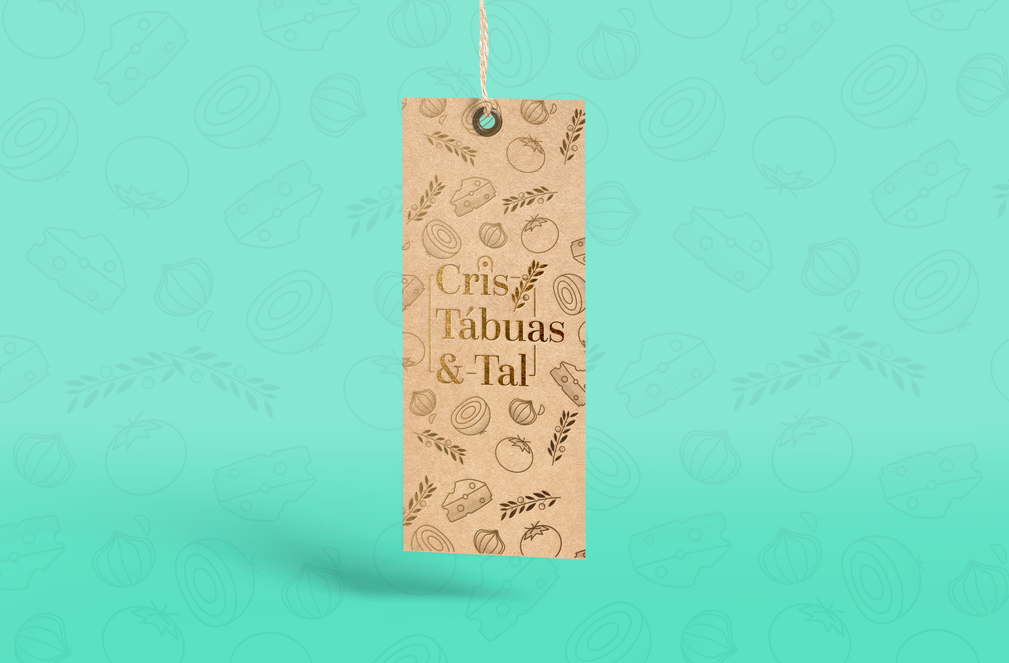

  • A benchmark with their competitors;
  • Some meetings to discuss the name and how she wanted to position in the industry;
  • Definition of the name with discussions about how remarkable the name could be, how easy to pronounce in Portuguese which helps clients remember it, and some discussions about shorter the name to make links easy;
  • List of logo references of similar industries, so the client could show their preferences, and the client chose 2 references and we started sketching;
  • After some elements choice we could properly draw everything required.
03
Results

The results were:


  • A logo with the name "Cris tábuas e tal", which was a mix of her name and elements that are common in the boxes as "board & etc";
  • The name was involved by a board element that is very common in showing off the boxes;
  • Elements that are part of the preparation of the boxes, such as Onions, Tomatoes, Garlic, and Cheese;
  • The client also asked for an Olive branch, to sound like seasoning and also to refer to her religion;
  • The logo was made with the elements to be in a round position to stickers but also able to add more elements to tags.

Related Work