Teka    •    Guimarães

Brand

  • Teresa Guimarães
  • Teka Guimarães
  • Brand
  • 2021
01
Problem

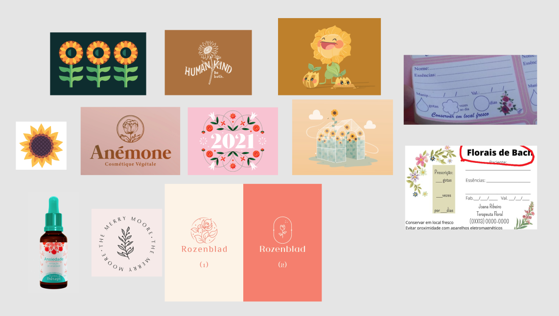
This client wanted a logo for their essential oils business. She wanted to bring elements such as sunflowers and things that referred to peaceful and nature connections.

The logo should bring those elements and the colours should also represent it.

02
Process

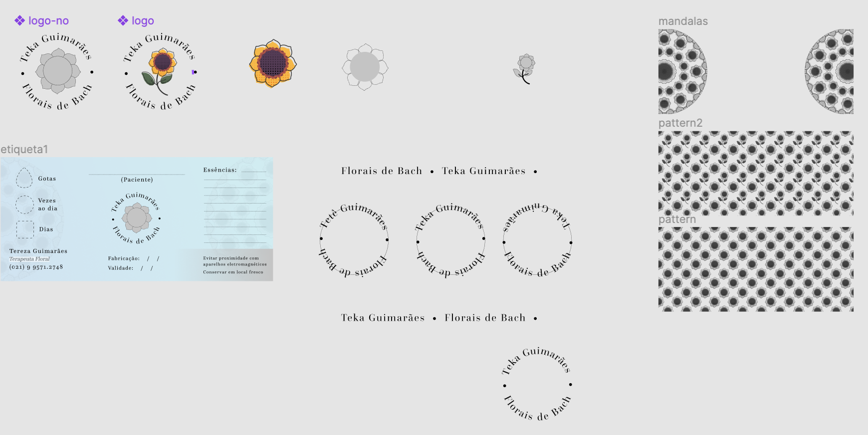
She wanted to use her nickname and surname "Teka Guimarães" but didn't have a final idea about the colours or flower, so we started with:
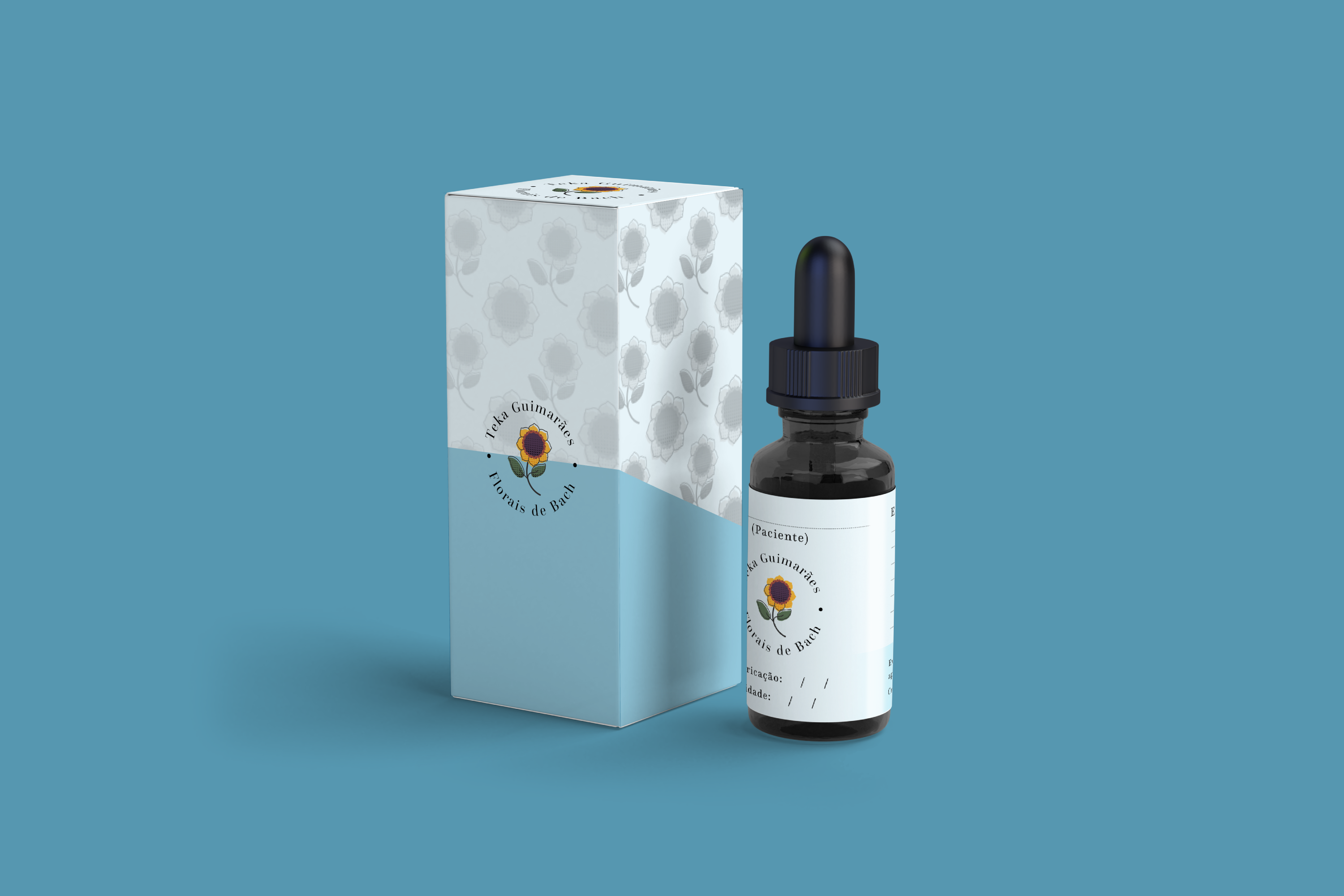
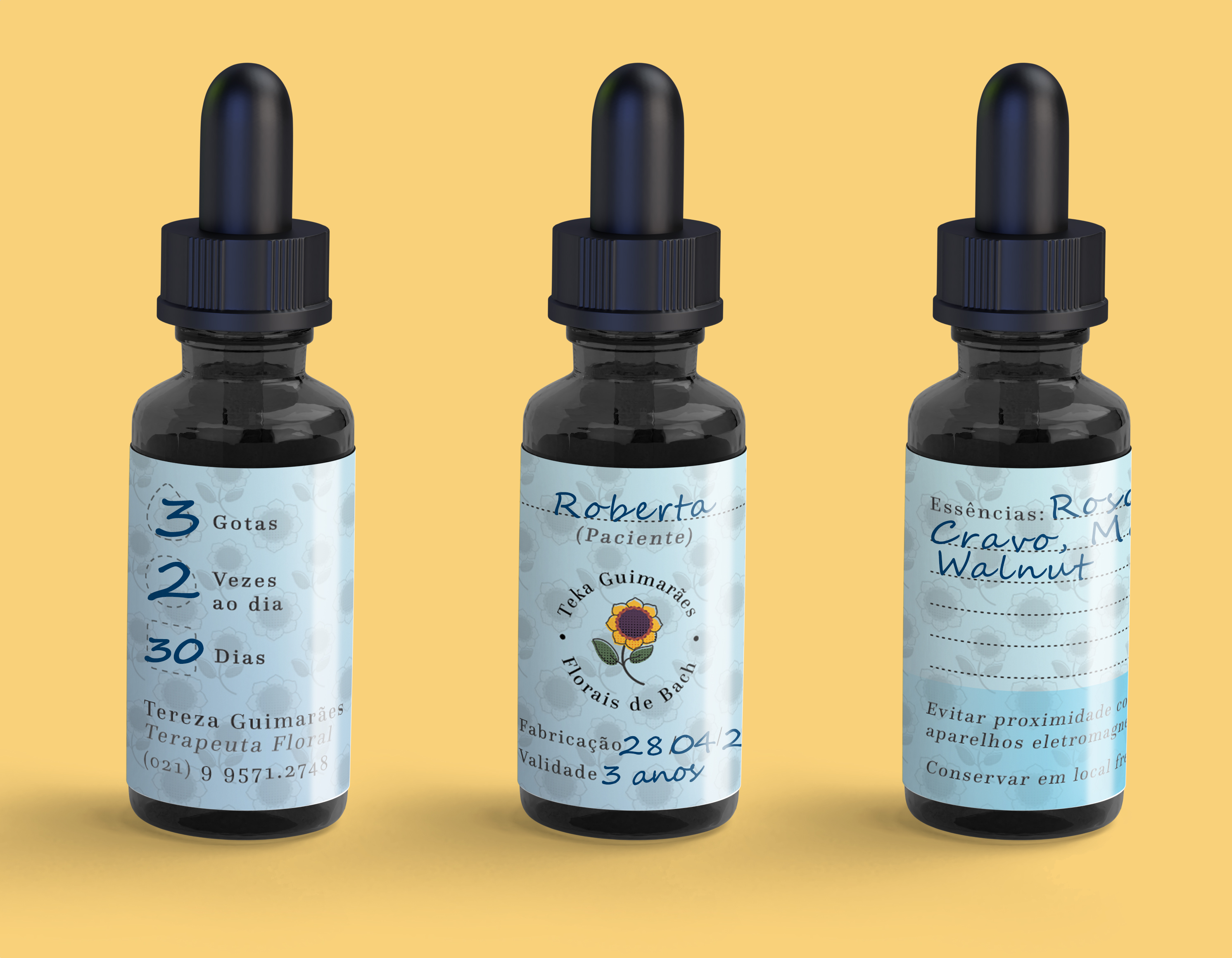

  • A benchmark with their competitors;
  • Some meetings to discuss the elements that she wanted to bring;
  • List of logo references of similar industries, so the client could show their preferences;
  • Some studies with the sunflower, if we would like to show the entire flower or just its canopy.
03
Results

The results were:


  • A pattern to be used on the boxes and the bottle sticker;
  • A logo to be shown in the bottles and in future to be used on a page;
  • Space for the patient's prescription information, such as how many drops, how many times a day, and for how many days;
  • More info as Fabrication, Expiration date, and which essential oils were used to make this mix.

Related Work