As an independent personal project, created for studying and portfolio purposes, with no affiliation with or commission from a bank. I focused on improving the vehicle financing journey. I conducted usability testing to identify friction, then used a research survey to refine my understanding of the findings. While designing changes to the flow, I applied usability heuristics to improve clarity, consistency, and ease of navigation, helping people understand their options and make informed decisions.
This project demonstrates how my skills transfer beyond games. Research, interaction design, information architecture, and usability testing are central to creating intuitive experiences across industries. Working with the complexity of games has strengthened my ability to simplify interconnected systems, communicate unfamiliar rules, and introduce information at the right moment. These are skills I can bring to banking and other digital products.
Exploring the Existing Flow and Preparing for Usability Testing
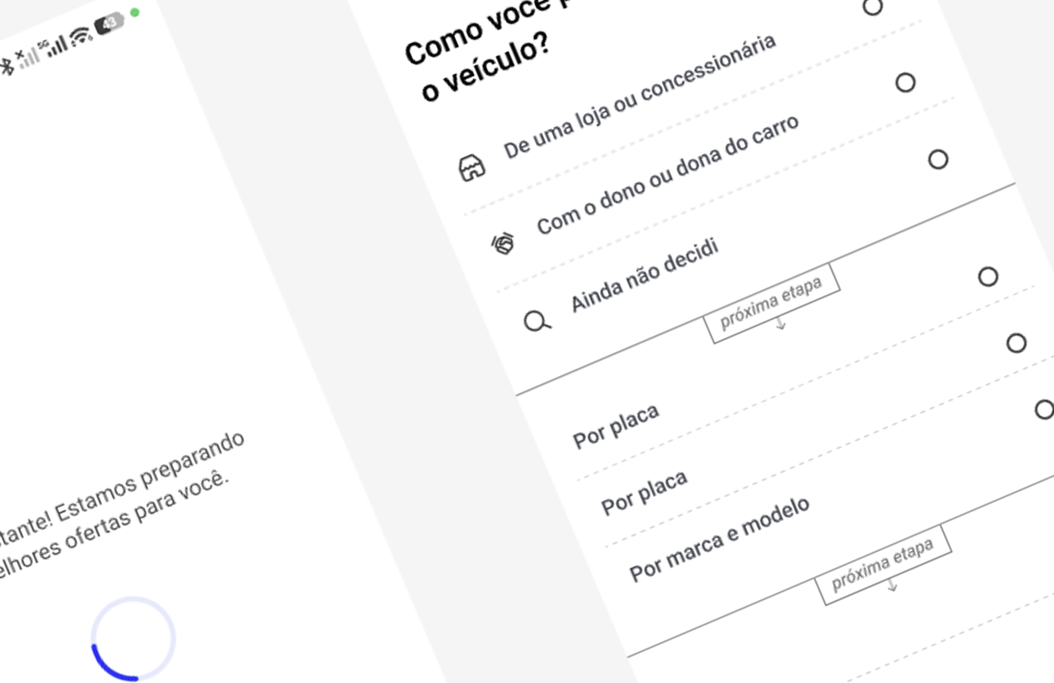
I began by going through the vehicle financing flow myself to understand how it worked, from the first step to the final stage. I captured screenshots throughout the process to document the screens, interactions, and information presented to users. Using these references, I recreated the journey as an interactive prototype in Figma.
This allowed me to prepare a consistent experience for usability testing, observe how participants navigated the flow, and identify moments where the steps, language, or available options caused confusion or friction.

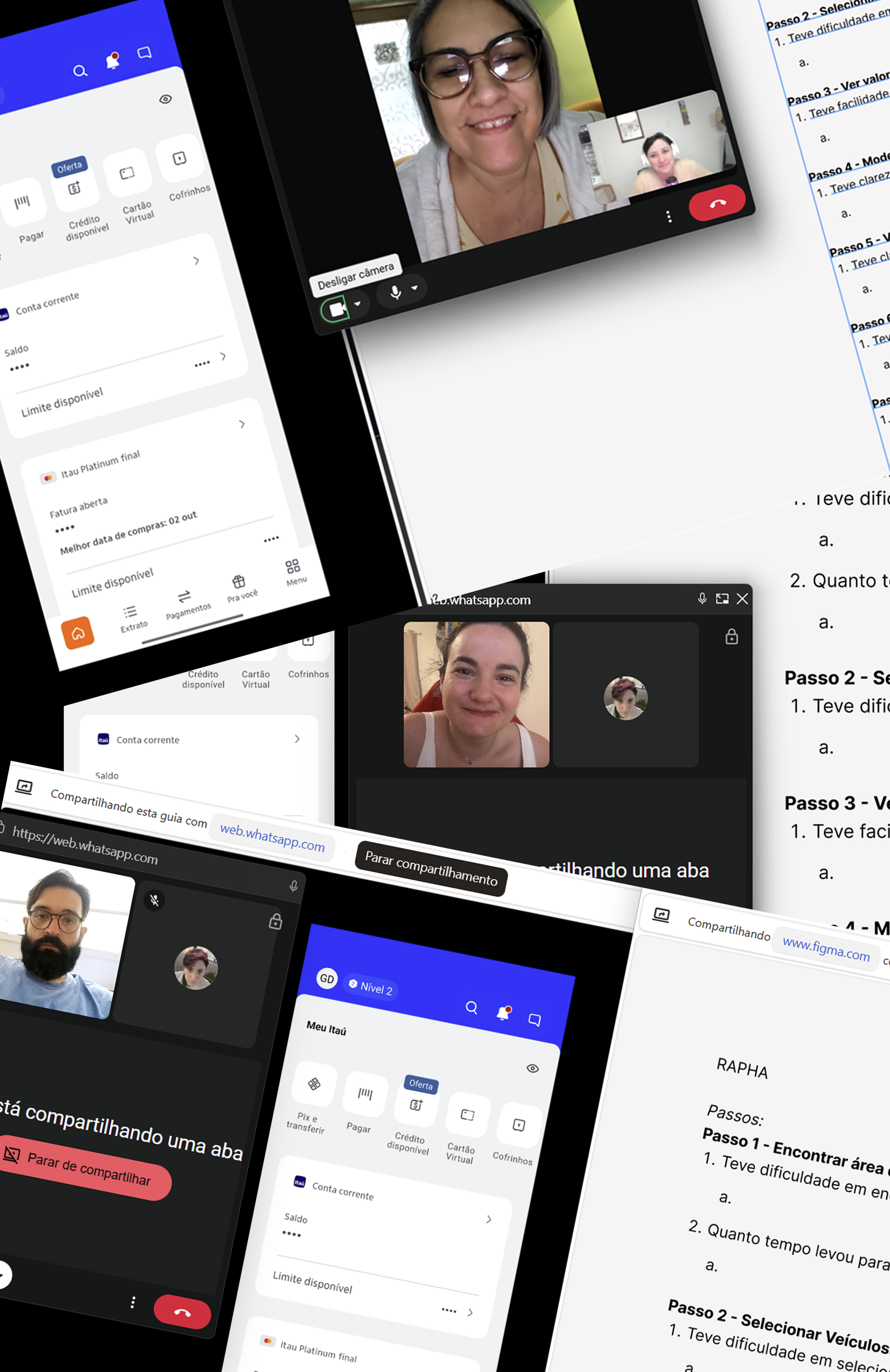
Planning & Conducting the Usability Test
I prepared a test script to explore three key questions: Could participants easily find the vehicle financing section? Was it easy to get a financing quote? Did the process feel time-consuming?
The script included step-by-step tasks, follow-up questions, and observation prompts to help me understand participants’ decisions and identify friction throughout the journey.
I ended with an open-ended question: “If you had a magic wand and could add or remove anything from this experience, what would it be? It’s also fine if nothing comes to mind.” This gave participants space to share needs or ideas that the earlier tasks might not have revealed.
Refining the Findings Through a Survey
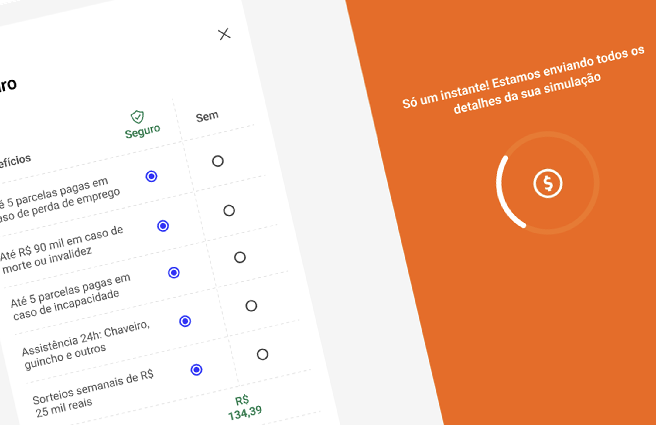
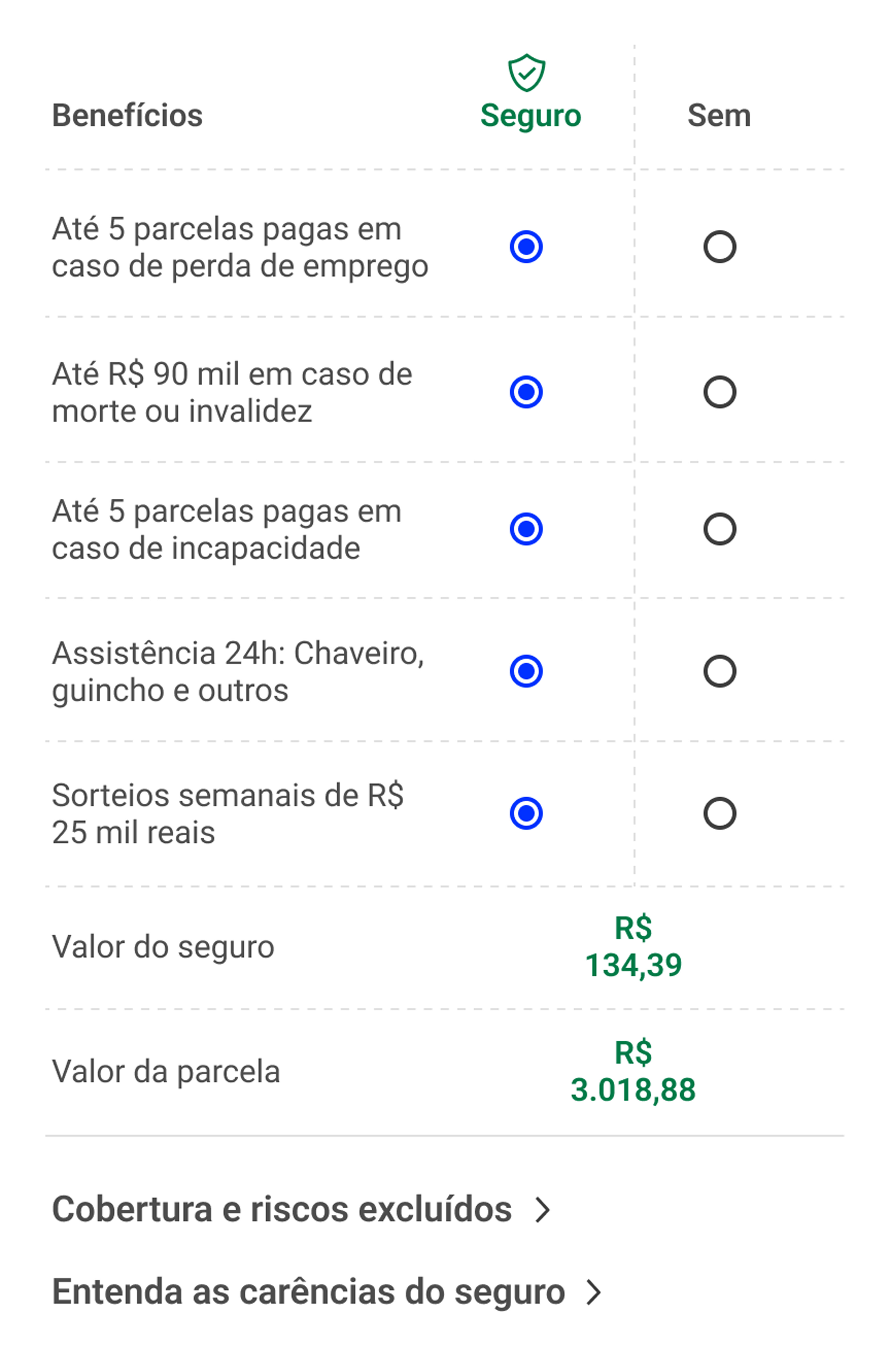
Usability testing revealed three main pain points: the time needed to complete the financing simulation, difficulty changing insurance details, and the lack of a clear way to contact the bank after submitting the simulation. Participants took between 10 to 30 minutes to complete the journey, with a significant portion of that time spent researching car prices. These findings raised questions that I explored further through a survey, adding quantitative context to the qualitative insights.
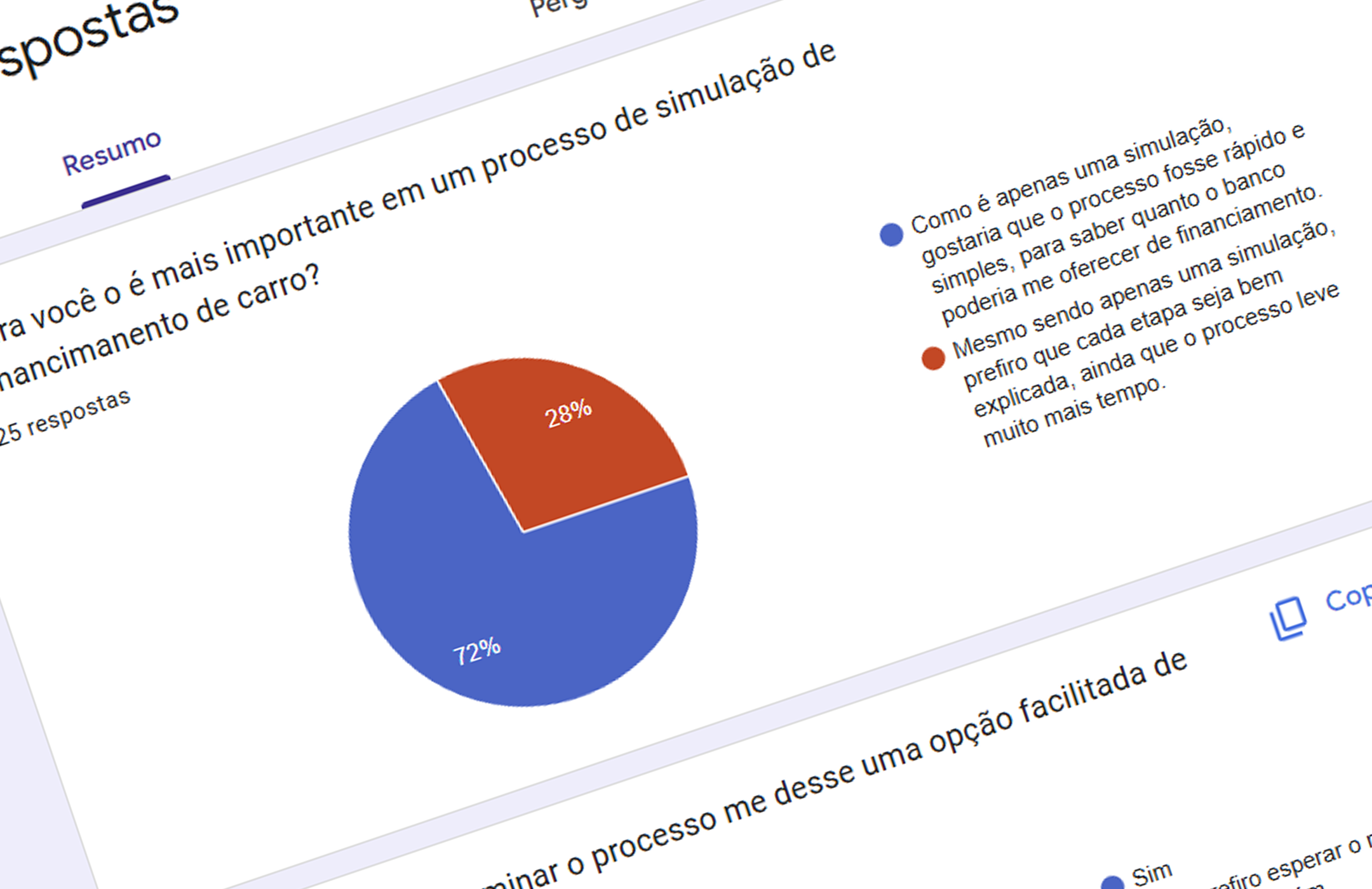
I created three short, direct questions with fixed response options to better understand participants’ perceptions of these issues. The survey received 25 responses from people in my personal network who use banking apps. Although this was a small convenience sample, it helped refine my understanding of the usability findings and inform the next design decisions.
See the prototype below.

Understanding What Participants Valued
The survey revealed three priorities among the 25 respondents:
These findings helped guide the redesign towards a quicker simulation, access to support, and greater control over insurance options. See the new prototype below.
Turning Findings into Design Improvements
Based on the usability tests and survey findings, I redesigned the flow to address the main points of friction:
I applied usability heuristics throughout the redesign, focusing on clear language, efficient navigation, and user control. To improve visibility of system status, I added explanatory messages to the necessary loading screens, helping users understand what was happening while they waited. These changes addressed the research findings and were then evaluated in a second round of usability testing.
Results: Testing the Redesigned Flow
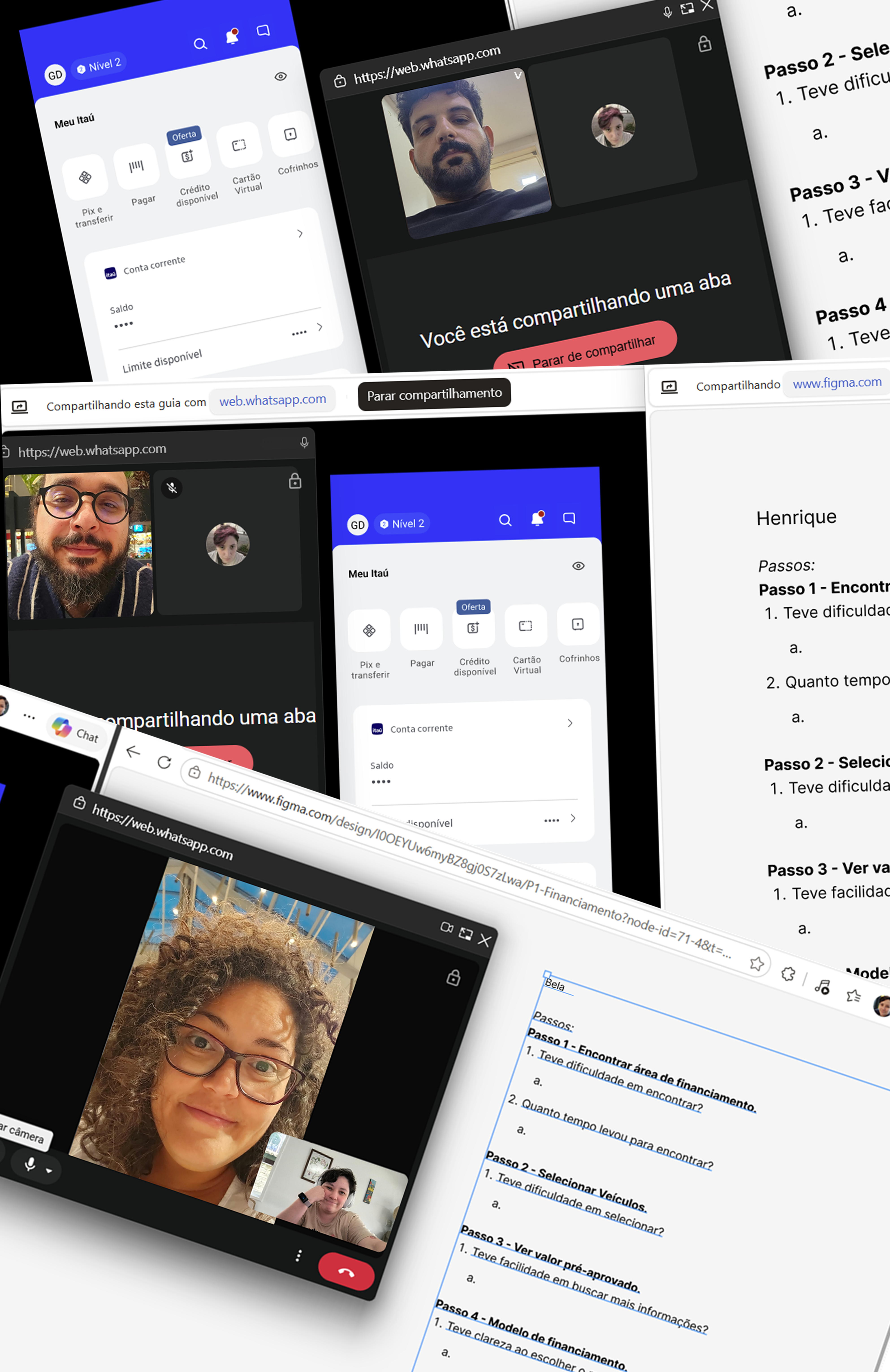
I conducted a second round of usability testing with five new participants to evaluate the updated prototype.
These findings suggest that the changes improved clarity, navigation, and user control. While the small sample and different participants limit direct comparisons, the second round provided encouraging evidence that the redesign addressed the friction observed in the initial tests.

Mars Horizon 2
Mars Horizon 2

Buraco Jogatina
Spades Jogatina